
To change an item only on mobile view (and not tablet or desktop) in Elementor Pro, follow these steps:
🔧 METHOD 1: Use Elementor’s Responsive Controls
Elementor has built-in responsive settings.
✅ To hide/show widgets per device:
- Click the widget you want to change.
- Go to the Advanced tab → Responsive.
- Use these options:
- Hide on Desktop ✅
- Hide on Tablet ✅
- Leave “Hide on Mobile” unchecked ❌
👉 Now this widget will only show on mobile.
- Duplicate the widget if needed:
- Create one version just for mobile, and another version for desktop/tablet.
- Use the responsive controls above to show/hide accordingly.
🛠 METHOD 2: Custom CSS for Mobile Only
If you want to change styles, not hide/show, use custom CSS with media queries.
✅ Steps:
- Click the widget → Advanced → Custom CSS (only in Elementor Pro).
- Paste CSS like this:
@media (max-width: 767px) {
selector {
/* Your mobile-only styles here */
background-color: red;
font-size: 14px;
}
}
📌 The selector refers to the current widget, column, or section.
💡 Bonus Tips:
- Mobile width breakpoint in Elementor = 767px and below.
- To test your design:
- Use Elementor’s preview icon (bottom left of panel).
- Toggle between Desktop / Tablet / Mobile views.
Here’s how to find Elementor’s Responsive Controls so you can show, hide, or style elements specifically for mobile, tablet, or desktop:
📍 Location of Responsive Controls in Elementor:
🔹 For Hiding Elements on Specific Devices:
- Click the widget, column, or section you want to edit.
- Go to the left panel.
- Click the Advanced tab.
- Scroll down to the Responsive section (usually at the bottom).
- You’ll see options:
- ✅ Hide on Desktop
- ✅ Hide on Tablet
- ✅ Hide on Mobile
✅ Check the boxes for the devices where you want to hide the item.
❌ Leave unchecked for devices where you want it to show.
🔹 For Responsive Design Controls (Padding, Margin, Font Size, etc.):
- Click the widget.
- Go to the Style or Layout tab (depending on what you’re editing).
- Look for the device icon.
- Next to fields like:
- Padding
- Margin
- Typography
- Image size
- Click that device icon.
- Now you can enter different values for:
- Desktop
- Tablet
- Mobile
🔹 To Switch Preview Modes:
- Bottom of the Elementor panel → Click the monitor icon 🖥️
- Choose:
- Desktop
- Tablet
- Mobile
Thank you for reading! Please stay connected with me on all my social media platforms. @djmakeart
For more updates, tips, and inspiration. Don’t forget to explore my website djmakeart.com for exclusive content and projects. Let’s create and grow together—see you there!
Contact us through www.djmakeart.com/contact-us/
🛠 Step-by-Step: How to Create a Vertical Video Template

Why Yoast seo setting doesnt appear

Why Yoast SEO may be malfunctioning on your website

Why the “Add Post to Story Every Time” Option Doesn’t Appear on My Account

Why is SEO Yoast option is not working ?
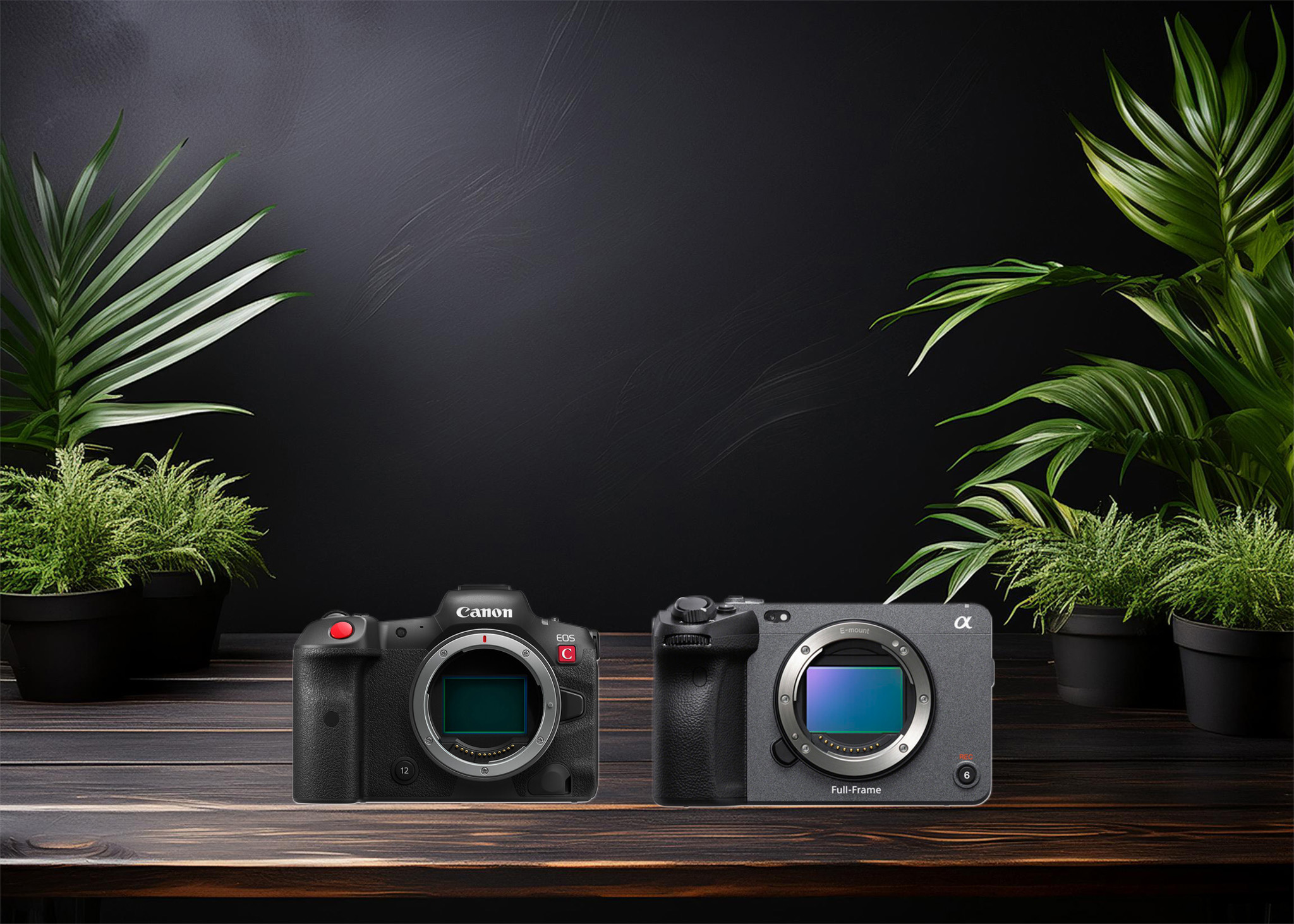
Which camera is better, Canon or Sony?
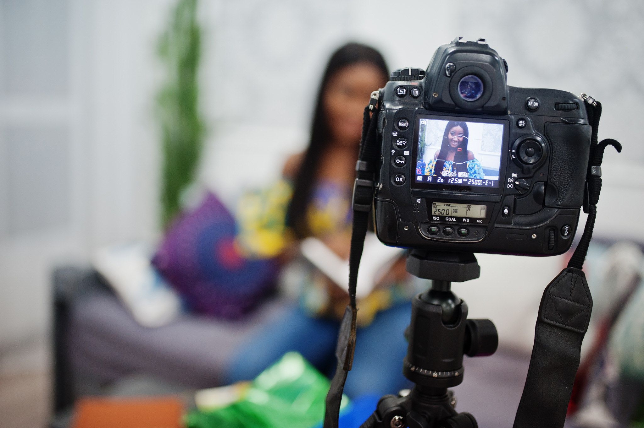
Where to Buy the Best Used Camera Gear in 2025: Trusted Sites & Smart Tips

Where can I find free VFX content for editing?

Where can I find free VFX content for editing?
Welcome to the DJMakeArt website