
If you’re building a responsive website using Elementor Pro, chances are you’ll want certain elements to display differently (or not at all) on mobile view, without affecting how they appear on desktop or tablet.
This guide walks you through how to change an item on mobile only—from hiding widgets to customizing styles—while preserving the integrity of your layout across all devices.
🧩 Why Use Device-Specific Changes?
Mobile users interact differently with websites than desktop or tablet users. Smaller screens require tighter spacing, simpler layouts, and optimized performance. You may want to:
- Hide large images on mobile
- Show a mobile-specific menu
- Adjust spacing or font sizes
- Replace a section entirely
With Elementor Pro, this is easy using Responsive Controls and custom visibility settings.
✅ Step-by-Step: Change an Item Only on Mobile View
🔹 1. Select the Widget or Section
Click on the widget or section you want to change on mobile only.
🔹 2. Duplicate the Item (Optional but Recommended)
If you want a different version for mobile:
- Right-click the element and choose Duplicate
- Keep one for desktop/tablet and the other for mobile
🔹 3. Use Responsive Settings to Hide/Show per Device
To show or hide a widget or section on specific devices:
- Select the item
- Go to the Advanced tab
- Open the Responsive dropdown
- Choose:
- Hide on Desktop
- Hide on Tablet
- Hide on Mobile
Use this to hide the desktop version on mobile, and vice versa.
🔹 4. Use Mobile-Only Styling (Without Duplicating)
If you’re not duplicating the item and just want to adjust the style only for mobile:
- Select the widget or section
- Click the mobile icon next to the styling option (like margin, padding, font size)
- Customize only for mobile
Elementor Pro allows device-specific styling. You’ll see small device icons next to most settings—click them to set unique values for mobile, tablet, or desktop.
🎯 Common Changes for Mobile View
- Typography: Use smaller font sizes for readability
- Spacing: Adjust padding/margin to prevent overflow
- Buttons: Make buttons full-width for easier tapping
- Images: Hide large background images for faster loading
- Layouts: Stack columns vertically instead of side by side
🧠 Pro Tips
- Use Navigator: Helps manage and hide/show duplicated items cleanly
- Label Sections: Rename your mobile-only or desktop-only sections for easy editing
- Test Responsiveness Frequently: Use Elementor’s preview options or browser tools
- Don’t Overcomplicate: The more duplicates and conditions, the harder the maintenance
🛠️ Example Use Case
You want to show a call-to-action banner on mobile only:
- Design your banner section
- Duplicate it
- Set one to “Hide on Desktop & Tablet.”
- Set the other to “Hide on Mobile.”
- Customize the mobile banner for compact viewing
Now, visitors only see the correct version based on their device!
🚀 Final Thoughts
Elementor Pro gives you powerful responsive controls to fine-tune your design per device. By using duplicated widgets, responsive visibility, and mobile-only style tweaks, you can craft a clean, mobile-optimized experience without affecting your desktop or tablet layouts.
If you need more customization, Elementor Pro also supports custom CSS per device, which lets you go even further with responsive design.
Let your creativity shine—responsively!
Thank you for reading! Please stay connected with me on all my social media platforms. @djmakeart
For more updates, tips, and inspiration. Don’t forget to explore my website djmakeart.com for exclusive content and projects. Let’s create and grow together—see you there!
Contact us through www.djmakeart.com/contact-us/

🛠 Step-by-Step: How to Create a Vertical Video Template

Why Yoast seo setting doesnt appear

Why Yoast SEO may be malfunctioning on your website

Why the “Add Post to Story Every Time” Option Doesn’t Appear on My Account

Why is SEO Yoast option is not working ?
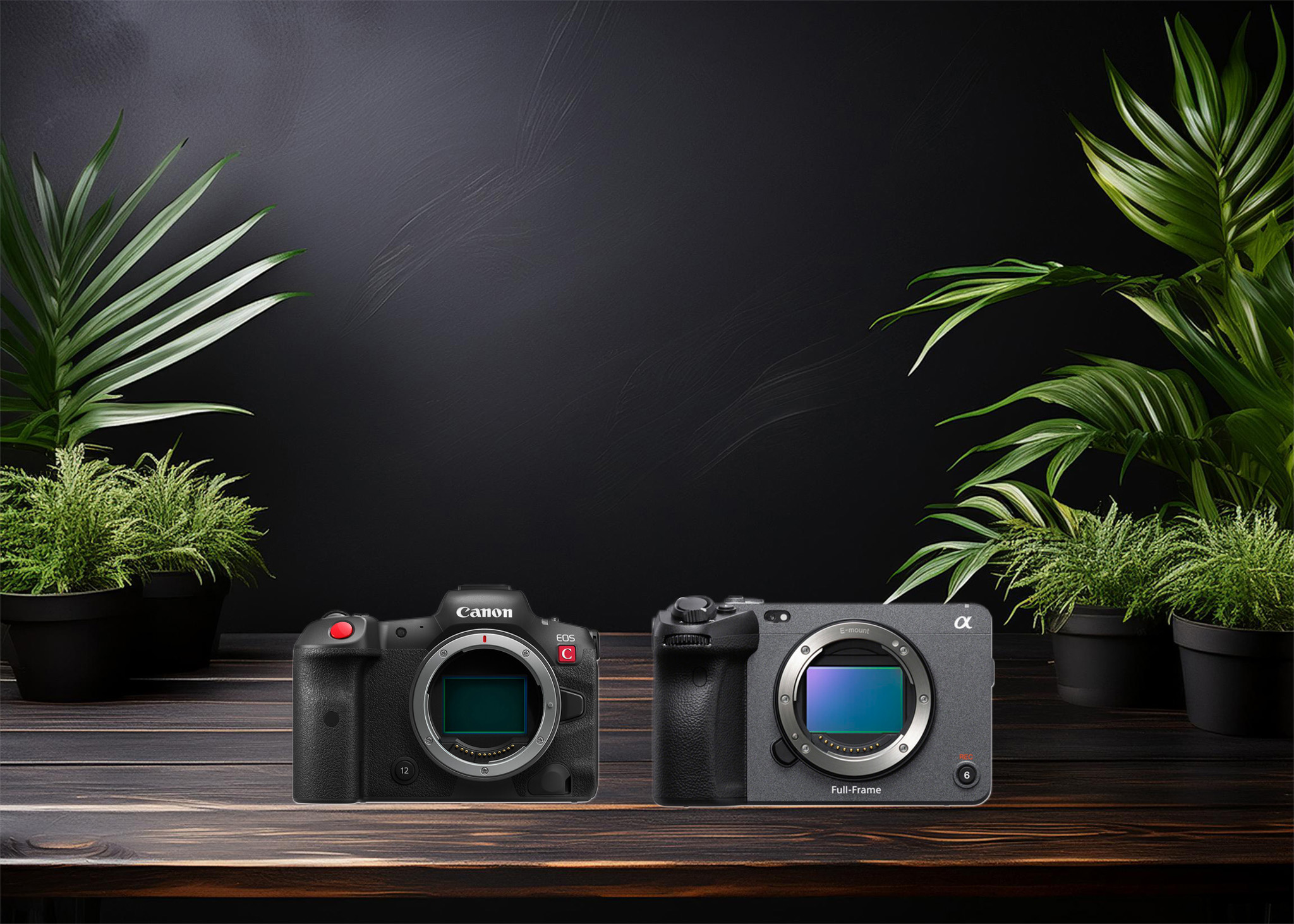
Which camera is better, Canon or Sony?

Where to Buy the Best Used Camera Gear in 2025: Trusted Sites & Smart Tips

Where can I find free VFX content for editing?

Where can I find free VFX content for editing?
Welcome to the DJMakeArt website